
This post is also available in:


Drag&Drop editor is a very intuitive tool for creating email templates.
Row
The basic building block of the template is the so-called row, which can be divided into several columns. It is necessary for the template to first contain a row into which further content can then be inserted.
Any row can be saved in its own Collection, or you can also use a row from a Prebuilt Collection.
Recommended Template Elements
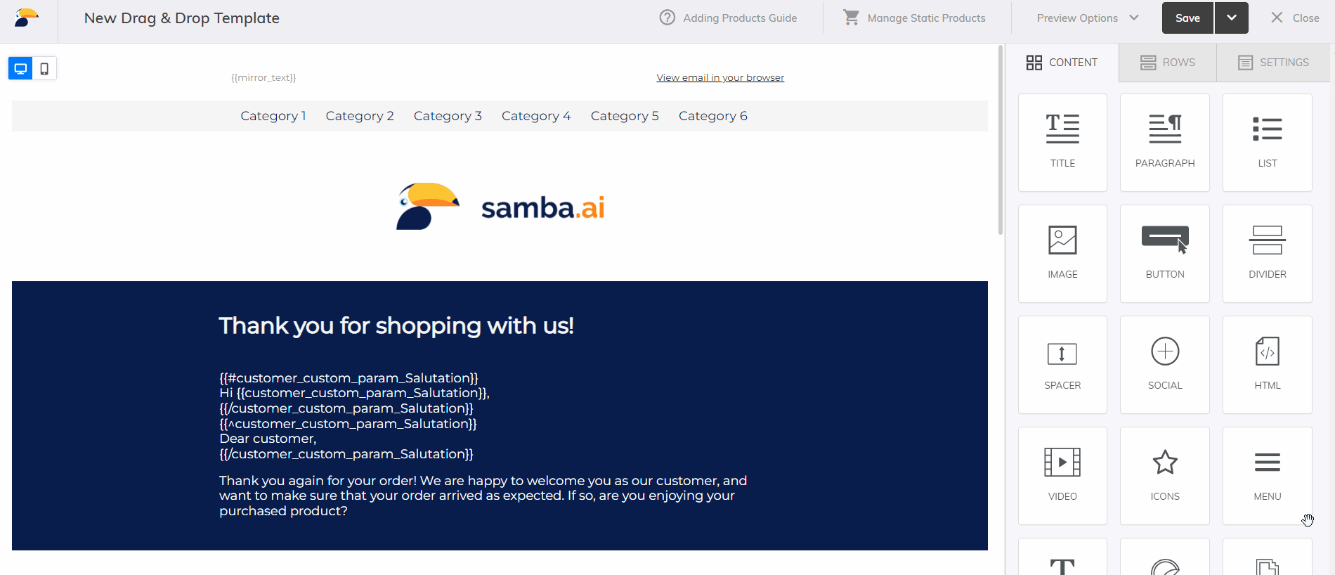
Below you will find a list of elements that every email template should contain. Some of these elements are dynamically evaluated by Samba for each recipient and therefore should be inserted as Merge Tags or mustache variables easily using the appropriate button in the text editor.
 That is, it is possible to insert Merge Tags directly into the template in a text element like any other text. Only if you want to use additional HTML code, you need to use the HTML content element see below.
Detailed instructions on how to work with merge tags can be found here.
Template Header
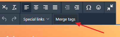
Link to the web version of the template
{{externalLink}}
Sometimes it may happen that the template is not displayed optimally to the user, e.g. due to a specific setting of their email client. For a full display, there is a link located right in the template header, which the user can click through and see the template as you intended it. It is typically inserted at the very top right of the template.
Preheader text
{{mirror_text}}
Preheader text or “mirror text” is text that is typically displayed in an email client next to the subject line. This is because the email client automatically displays a certain part of the beginning of the text from the template. We therefore recommend having this dynamic element at the very top left of the template and controlling its content easily in the campaign settings where this template is used.

If you want to make this text invisible in the template, you can set the same font color as the background color, or use HTML content with this code:
<p style="display:none;color:transparent;font-size: 1px;margin: 0; line-height: 18px">{{mirror_text}}</p>
To hide all other text after the preheader text in the preview in the email client (so that only the preheader text is displayed next to the email subject and not other text from the email), you can use the following code based on this tutorial and insert it into the HTML element right after the preheader text:
<div style="display: none; max-height: 0px; overflow: hidden;">
͏‌ ͏‌ ͏‌ ͏‌ ͏‌ ͏‌ ͏‌ ͏‌ ͏‌ ͏‌ ͏‌ ͏‌ ͏‌ ͏‌ ͏‌ ͏‌ ͏‌ ͏‌ ͏‌ ͏‌ ͏‌ ͏‌ ͏‌ ͏‌ ͏‌
͏‌ ͏‌ ͏‌ ͏‌ ͏‌ ͏‌ ͏‌ ͏‌ ͏‌ ͏‌ ͏‌ ͏‌ ͏‌ ͏‌ ͏‌ ͏‌ ͏‌ ͏‌ ͏‌ ͏‌ ͏‌ ͏‌ ͏‌ ͏‌ ͏‌
͏‌ ͏‌ ͏‌ ͏‌ ͏‌ ͏‌ ͏‌ ͏‌ ͏‌ ͏‌ ͏‌ ͏‌ ͏‌ ͏‌ ͏‌ ͏‌ ͏‌ ͏‌ ͏‌ ͏‌ ͏‌ ͏‌ ͏‌ ͏‌ ͏‌
</div>
To use both of these advanced features, simply copy both codes and paste them together into a single HTML content element in the template header.

Template Footer
Identification of the sender
The footer must uniquely identify you as the sender of the newsletter. This identification is deemed to be the name, registration number and physical address of the sender.
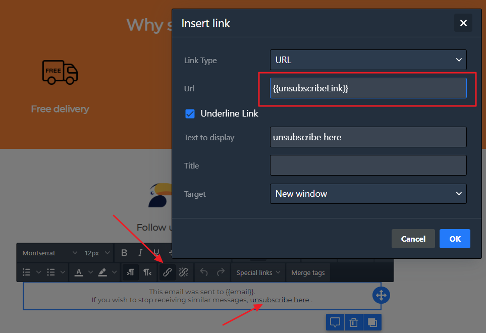
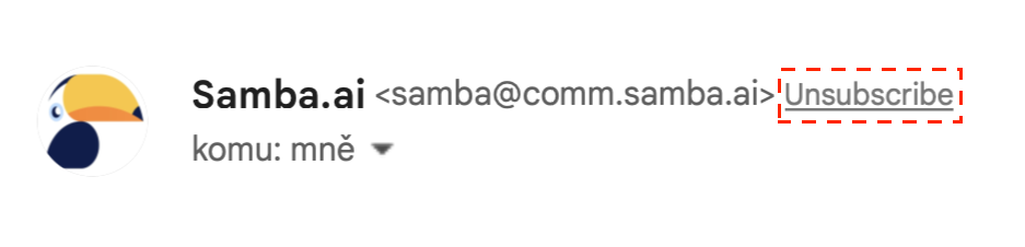
Unsubscribe link
{{unsubscribeLink}}
An unsubscribe link is an essential part of every marketing email. It must be prominently displayed so that the user can easily click through it to unsubscribe from the newsletter.
It is unnecessary and illegal by law to hide this link or make it difficult to find – you will be working against yourself. You do not want to have a customer who does not want to receive newsletters in your database, because there is only the risk of a damaged reputation after your communications are subsequently marked as SPAM. So be rational and look after those customers who are genuinely interested in your newsletters.
In addition, Samba supports one-click unsubscribe, so that supported email clients (e.g. Gmail, Yahoo) display an “Unsubscribe” button directly next to the sender’s details.
Recipient’s email address
{{email}}
For the purpose of identifying the recipient to whom the email was sent, it is recommended to insert this Merge Tag in the footer of each email. For example, sometimes customers do not remember that they have mail forwarded to their inbox from the email they signed up for your newsletters with.

General Template Settings
Certain settings can be configured within the general template settings, which can be further modified for sub-elements in the template (rows). These general settings help keep the style of the entire template consistent.
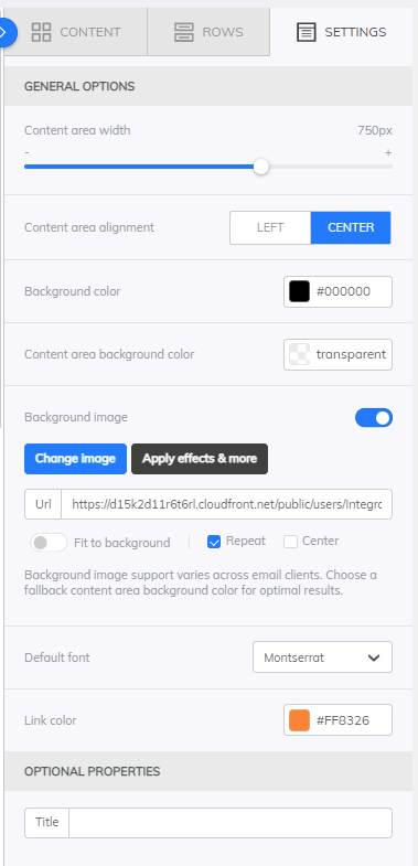
Template Background
You can set the template background (including borders) or just the background of the part of the template that contains the content (i.e. typically the middle part of the template).
You can also select an image as the background with several options:
- Fit to background – the image will fit to cover the entire template.
- We recommend using this setting when using a row-level background image, where it is also available. This will achieve optimal display on mobile devices, where the image will cover the entire phone screen for a given row just as it does on desktop.
- Repeat – the image will be repeated several times in the template if it is not large enough for the template
- Center – the image will be centered on the template
Tracking Links
Samba automatically adds its tracking codes to all links, as well as the UTM parameters you set within the campaign. So you don’t need to add any parameters or codes to your email template – everything happens automatically.
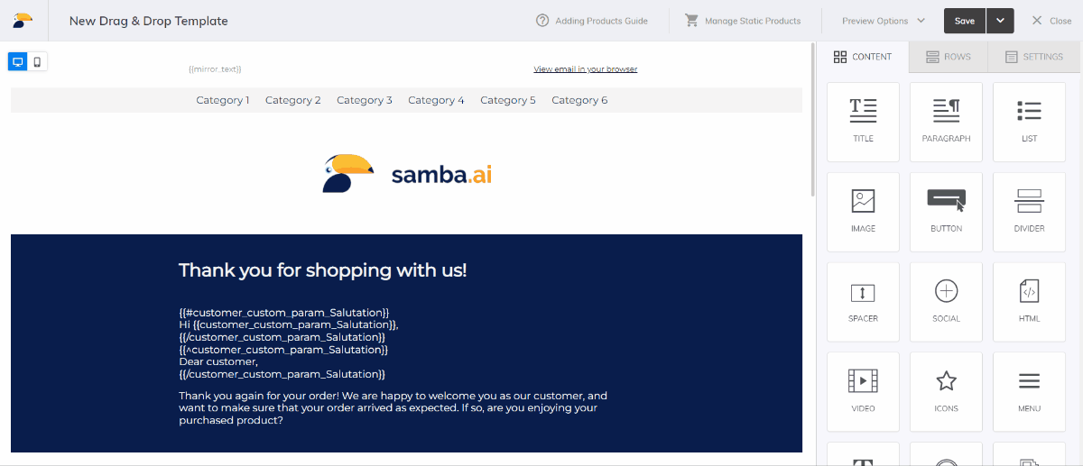
Content Elements of the Template
You can insert the following elements into the template, i.e. into individual rows:
- TITLE
- This element is used to create headings.
- PARAGRAPH
- Used to create text blocks.
- LIST
- Used to create bulleted lists (numbered or just symbols).
- IMAGE
- Allows you to insert images into a template. You can upload your own image or just insert a link to the image. It is recommended to keep the uploaded images organized in folders for easier management.
- We recommend not uploading images wider than 1920px to the file manager, otherwise they will be automatically resized. This can cause e.g. loss of motion of GIF images.
- BUTTON
- Used for inserting buttons with links.
- TABLE
- This element can be used to style tables.
- DIVIDER
- Allows you to insert a separator in the form of a horizontal line that can be further styled.
- SPACER
- Allows you to insert a separator in the form of a vertical space.
- SOCIAL
- Used to insert icons with links to social networks.
- HTML
- Allows you to insert any piece of HTML code. This element can be used to code any custom design that Drag&Drop does not allow.
- VIDEO
- Used for embedding videos.
- ICONS
- Allows you to insert icons e.g. as an interesting visual element to separate a piece of content.
- MENU
- Used to create a menu that behaves responsively on mobile devices (expands and collapses).
- TEXT
- This is an original element that is no longer developed – it has been replaced by 2 new elements PARAGRAPH and LIST, which are better optimized to display properly on all email clients.
- STICKERS
- Allows you to insert animations using the Giphy database.
- GIFS
- Allows you to embed funny gifs and memes using the Giphy database.
Other Template Elements
Product Personalisation and Product Tiles
Static product tiles or dynamically personalised products tailored to your customers can be easily inserted into templates. Learn more in this article.
Coupons
Instructions for working with coupons can be found here. In the Drag&Drop editor, links to coupon stacks can be found under the Merge Tags button.
They are always in the format {{coupon_value_COUPONPOOL}}, where COUPONPOOL is the value of the coupon pool name.
Basic Customer Parameters
You can use the following merge tags in all email campaigns except External campaigns and API triggers where there is no connection to the customer:
{{email}}– email address of the recipient (see also here){{customer_id}}– ID of the recipient-
{{customer_first_name}}– first name of the recipient (can be used as customer salutation) -
{{customer_last_name}}– last name of the recipient
Custom Customer Parameters
Any custom customer parameter you have listed in the customer feed can be dynamically inserted into the template for each recipient. If the value of the parameter does not exist for any recipient, nothing will be added.
In the Drag&Drop editor, links to custom customer parameters can be found under the Merge Tags button.
They are always in the format {{customer_custom_param_PARAMETERNAME}}, where PARAMETERNAME is the value of the parameter name with spaces etc. automatically encoded for optimal processing.
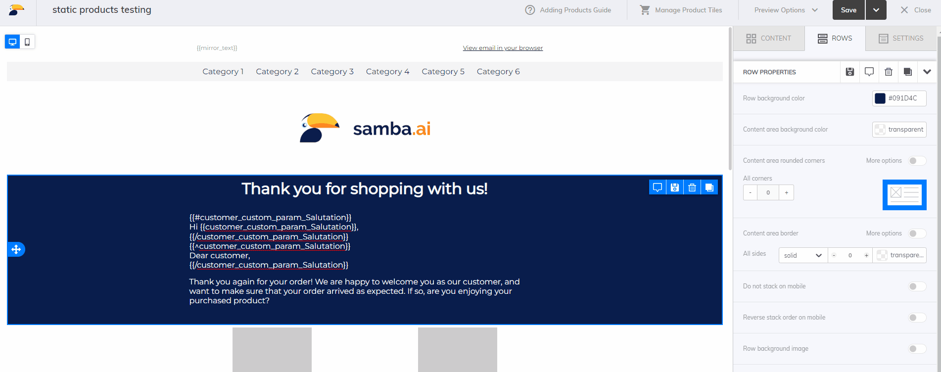
Display conditions based on the existence of a custom parameter
You can use IF/ELSE conditions to set a certain part of the template to be displayed only to certain recipients. This is done by using the # hash, / slash, and ^ caret symbols. This is done in the same way as for conditioning based on the existence of a product attribute, see Visibility of product attributes. The important point here is that by the existence of a value we mean really any value.
{{#customer_custom_param_PARAMETERX}}
This section will only be displayed if a specific customer has a custom parameter PARAMETERX.
{{/customer_custom_param_PARAMETERX}}
{{^customer_custom_param_PARAMETERX}}
This section is only displayed if the specific customer does not have a custom parameter PARAMETERX .
{{/customer_custom_param_PARAMETERX}}
The same construction is also used, for example, for the use of customer salutation.
In the customers feed, a typical example of this is using this method with the value “1” for customers that meet a certain property and, conversely, not using the custom parameter at all for customers that do not meet the property. For example, providing a value of “0” for customers not meeting the property would mean that the existence of a value would be met for these customers as well, causing unexpected behavior.
Mobile design view
Templates created in our Drag & Drop editor are automatically responsive. This means that their display adapts to the size of the display on which the user views the template.
Responsive behaviour
Typical behaviour is, for example, in smaller displays (especially mobile phones) to stack individual content underneath each other so that it is always sufficiently legible. You can turn this behaviour off with the Do not stack on mobile option.
If you want to reverse the stacking (i.e. your content read from left to right will be stacked from top to bottom in reverse order on mobile), use the Reverse stack on mobile option.
If you want to completely hide some content (a whole row or just a selected content element) on mobile or desktop, use the Hide on mobile/desktop option. With this setting, you can easily create special content to display on large or small displays.
 Mobile view preview can be found either classically in Preview Options>Preview, where you can switch between Desktop and Mobile view.
 The other option is to use the toggle switches directly in the edit mode on the top left, so you can easily edit individual views and see the result right away.
This post is also available in: